ABC KIDS LISTEN APP
Student work for UX Design Course at RMIT Online.
Our task was to choose an existing digital product which frustrates us, and conduct a full UX research and design process to produce a user tested medium-high fidelity prototype.
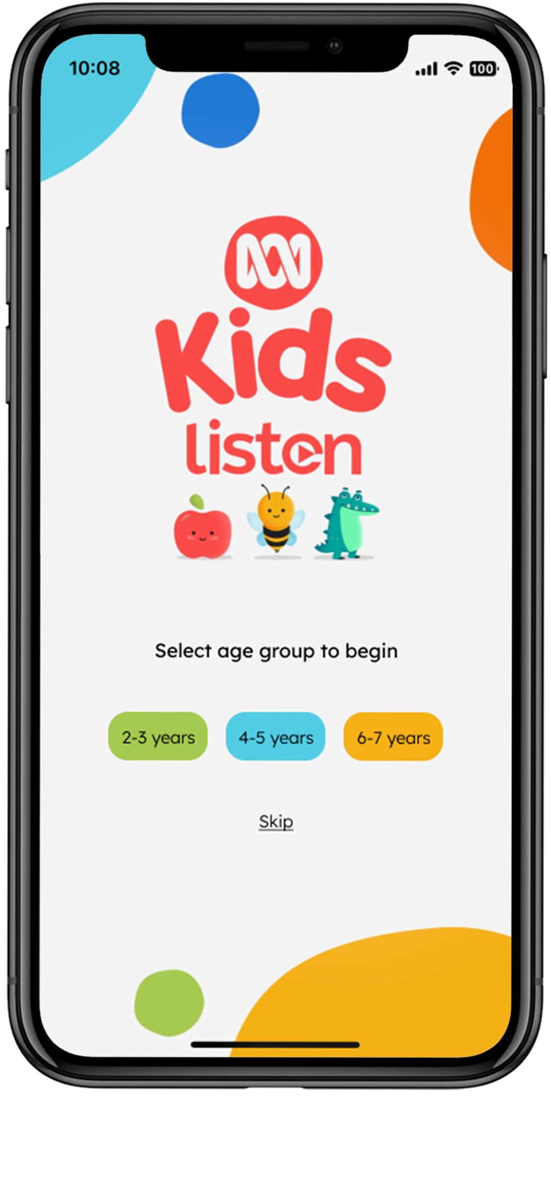
ABC Kids Listen is a completely free content based app, that offers radio for kids (live) and on demand stories, music, sleep sounds and more in a safe and educational setting.

The Problem Hunch
Users might find it difficult to locate the content their kids want because the navigation is confusing and individual tracks cannot be selected within playlists.
Desk Research
I read through all reviews in the App Store and found several comments related to navigation issues.
I also reviewed similar and competitor apps such as Kinderling and Spotify which both have a better user experience.
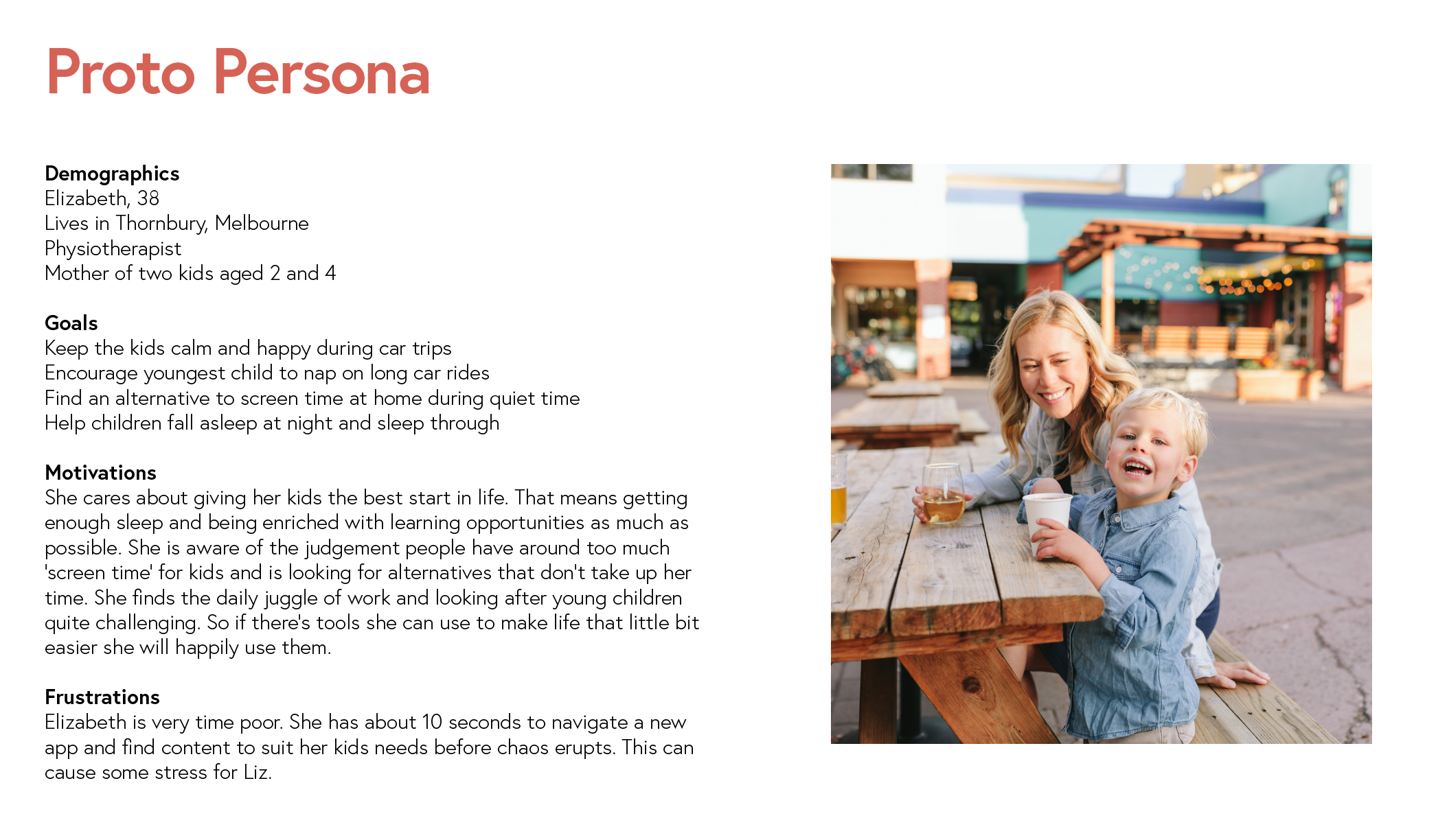
Interviews & Insights
I conducted three interviews with mothers of young children in Melbourne. I also ran a card sort activity with one participant.
Post affinity mapping, the following themes were discovered:
Navigation is unclear but icons are useful
No search function is frustrating
Users are annoyed you can’t select tracks in playlists
Finding age appropriate content takes too long

“It would be nice if I could cut through the content to just see what my three year old would like”
“I dont have time to go in and search for age appropriate content”
“My son likes to choose specific stories but you can’t, so we use Spotify if we want something in particular.”

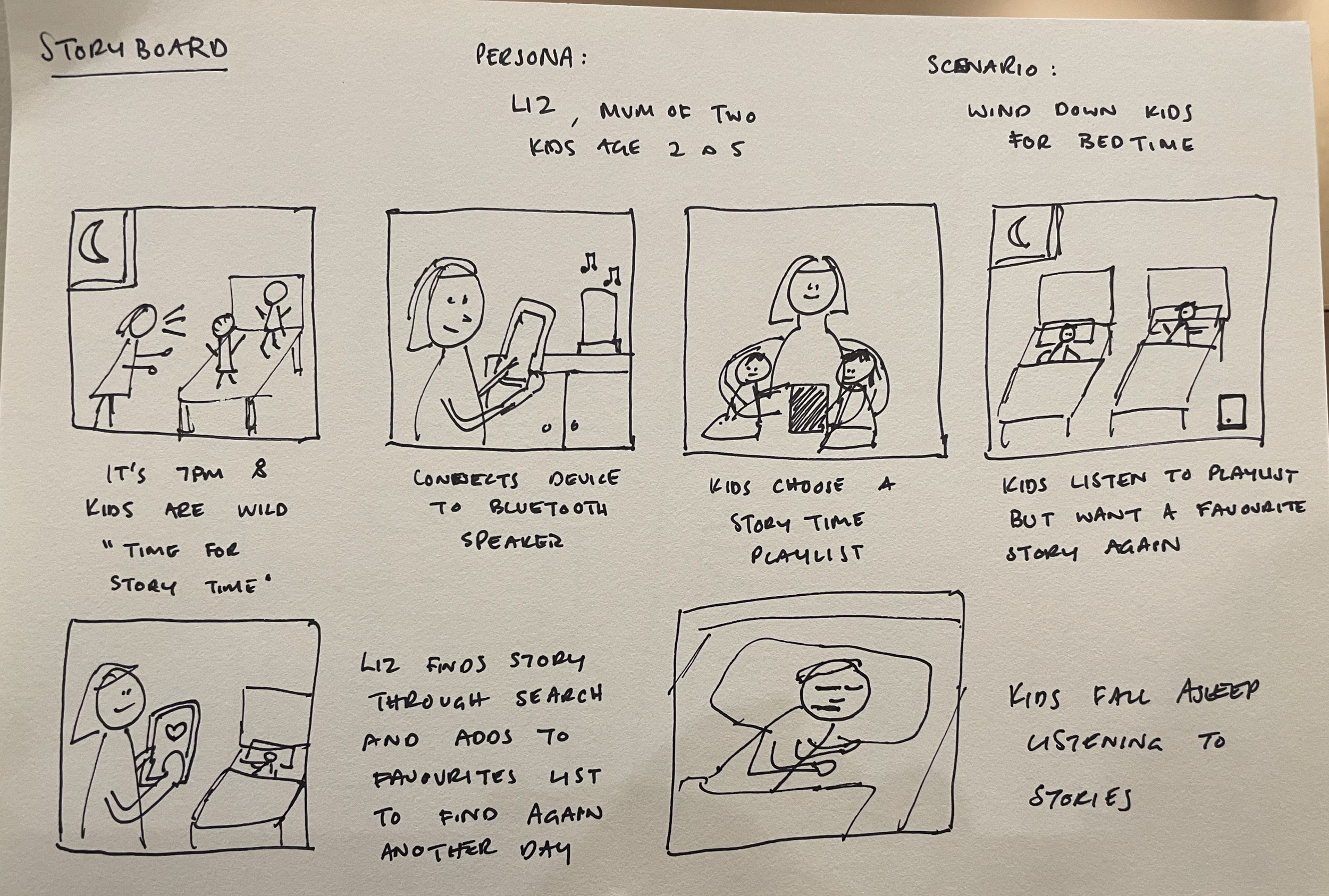
Ideation & Prioritisation
Sketching Crazy 8’s and storyboarding was helpful to flesh out ideas.
I then ranked the ideas using the UCD framework, and chose the top 4 performers to progress to user flow and prototyping stage.

User Flow
I used Figma to design a new user flow for the app.

Low Fidelity Prototype
I sketched lo-fi prototypes by hand, and refined until ready to design digitally in Figma.

User Testing
I ran user tests in Maze and audio recorded the users to get valuable feedback on my mid-fi prototype.


Synthesising Results
I used Miro to find themes in the feedback and inform priorities for improvement.

Final Prototype
I used Figma to design a final clickable prototype, incorporating feedback from testing. It’s now ready for a UI update!
Course Feedback
“Great work Emily. Thank you for submitting your final assignment, and well done on making it through the course! You’ve been easily able to clearly address all of the points in the marking rubric and clearly lay them out in your well designed presentation. The quality of the final prototype and solution was high, using your graphic design skills to keep in inline with the existing ABC Kids style guide.
I was initially skeptical of your choice of a product, but you clearly outlined throughout the semester and in the final presentation the problems that users would and do have with it. The taxonomy and structure that they chose, while clever, has usability issues when the app is being used and how users think about and match it to their mental model. You excelled in your choice of research studies and the learnings you got from them, as well as calling out where it didn’t work so well and how you mitigated the issues.
There is a clear progression in the lessons learnt and how they affected the end result. The tightened up home screen looks great and I appreciate including more content and navigation by including more buttons and playlists in a tighter space, but I wonder if we forgot to consider another user group throughout the whole process: a young child. Perhaps parents need to handle the app for toddlers etc, but perhaps older kids (4-7 etc) would also be a user group. Contrasting the adult results with results from children would have been a great exercise. Next time! Niggles aside, this is a great submission and shows how much you’ve learnt and the professional interest you have in UX.” - Daniel Neville.